
College Art Work-Drawing
- Sydney Flatness

- Mar 4, 2019
- 4 min read
Updated: Feb 4, 2022
This blog includes my work made in both drawing and/or painting classes. Drawing is my emphasis for my major currently. We can choose to either take a majority painting, design, drawing, or printing classes. I chose drawing because I understand the media and technique within it the most. I also think it is a little more forgiving than painting and design.
Enjoy!

Chalk Pastel. Project in Introduction to Drawing II class. This project required that we create a work using chalk pastels. We practiced with the media for a couple of days in class to understand the different techniques we could use.

Watercolor and micron pen. Project in Intro to Drawing II. This project required us to use a water-based media alongside with a media that is able to be applied finely. I choose these two media because I felt like I had a good understanding of both. However, I used a more controlled technique with the watercolor as I have never used it this way.

Colored pencil. Intro to Drawing II. This project simply required us to create a work using colored pencils as a means to understand how the media could be "blended" by overlaying colors on top of one another as well as different ways to use the media. We were required to use cool and/or warm-toned colors. I choose to make the trumpet valves cool toned and the background warm.


Graphite. Intro. to Drawing I. This project required us to draw our hand as a still life while it was in a position that was interesting. Though the picture is VERY low res, we were required to draw as lifelike as possible.

Charcoal. Intro to Drawing I. This project required us to learn and use sighting skills to map out a still life that was set up in front of us. We were to make measurements and to "show our work" by making sighting lines on the drawing.

Ballpoint Pen. Intro. to Drawing I. This project required us to draw a dead Yucca plant with as much accuracy as possible. This was a still life drawing and we were required to use a pen. The professor emphasized how this project would affect us both mentally and spiritually as we would draw. This is a picture taken half-way through the completion of the drawing.
Charcoal. Intro to Drawing I. This project required us to work with other students in the room. We would first have five minutes to roughly sketch out a still life and then, we would rotate around the room and move to another student's artwork. Every time we got to a new person's art, we would rotate the image 90 degrees to the right as well as drawing the same still life at a different scale. After about five rounds, we were to return to our original artwork and refine it.

Charcoal. Intro. to Drawing I. For this project we were to draw a perspective drawing from life. We were encouraged to go anywhere in the art building or anywhere on campus if we wished. We needed to be able to sight angles and be able to recognize when the perspective looked "off".

Newspaper, pistachio shells, and acrylic paint on Walmart canvas. For this project, we were required to make a work that was made of a non-conventional media. I wanted to explore texture and to further understand how painting can interact with the paper and how it would pool within the shapes. I added on to it bit by bit to eventually have paper go off the edge of the canvas as to not be "contained" by the borders of the canvas.

Watercolor markers, watercolor pencil, pallet watercolor, and micron. This was the first drawing for my Drawing I class my Fall semester of my Sophomore year at Grand View. The prompt was to create a meaningful work inspired by an organic shape. I chose to use Ginkgo tree leaves as my inspiration. By using the flow of the leaves and the emphasis of color, I created a tension
between the nearly touching leaves and the "heat" created by the closeness of the leaves. I did this as a reflection of how humans feel when we enter into a new and exciting relationship.

Watercolor pallet and micron. This year the President of the University chose my Drawing I class to create possible designs for the Christmas card that would be sent out to close friends of Grand View. We were given perimeters that the design had to, in some way, relate back to the original Christian story of the birth of Jesus. I decided to draw the ceramic figures from the Nativity Scene from my home. Unfortunately, this design was not picked for the card but it was very interesting to be a part of the process.


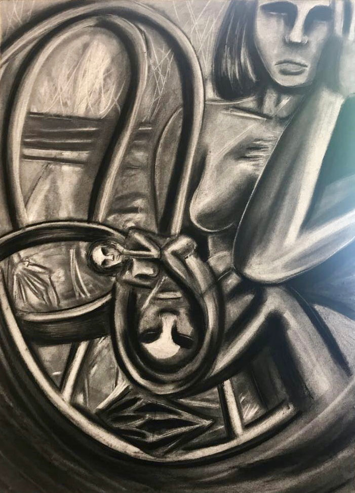
(Left drawing) Charcoal and graphite, (right drawing) Graphite, chalk pastel, and colored pencil. This was one of the favorite drawings/ prompts for Drawing I. The idea we had to go with was 'presence v. absence'. I choose to do self portraits to represent how I feel being present around people (left) and how I feel when I am absent/alone (right). As I relate more to the absent side of myself, I am presented more realistically and comfortably. The use of color is to emphasis that this part of me is my true self and that the other side is black and white/ not real. I chose to make them look at each other to show the tension that is between them. The Present side of me is some what envious of the absent side. She would much rather be at home but she knows she can't. The absent side of me feels pity for the other because she knows that the present self is not happy there. They fight to be the one on top but they know they are forever linked in a back and forth battle.

This piece was my final for my Drawing class junior year. We were allowed to make anything we wanted so I decided to draw some of my friends. I asked them what their favorite feature was about themselves and when I drew them I left out that feature. I wanted to emphasize that they didn't need their "best feature" to be beautiful.


Comments