
College Art Work- Design
- Sydney Flatness

- Mar 4, 2019
- 5 min read
Updated: Jan 28, 2022
This blog will be specifically for the art work that I have made in my design related classes. This includes projects like collage, oil pastels, adobe photoshop, adobe illustrator, and much more. I will try to post both the finished projects as well as my notes for my thinking.


Adobe Photoshop. Intro to Fundamentals on Design II. For this project we were required to create a 18"x24" POMO (post modern) Poster. We were required to create 12 thumbnails and refined ideas for 3 of them after being given three words. My words were litter, lemon-yellow, and enrage. I ended up with a concept that described how useless items like pie scented trash bags (or just a dumb infomercial product) can be pushed in your face so much, the real news and issues are being covered up. The second picture is my thumbnails. As you can see, I ran with the idea showing the the first column, third row.


Micron Pen. Principals of Design I. For this project we were to pick 16 words from a list given to us. After we got our words, we were to make up rough drafts for a design that represents the word in a non-literal way. We then finalized our rough drafts and drew them in micron pen on poster board.

Oil Pastel. Principals of design I. For this project we needed to choose a concept or topic and then create 8 different designs. My topic was family. Moving from left to right and then left to right on the second row the words I used where: First Sight, First Kiss, I Love You, Marriage, Sickness and in Health, Pregnancy, Home, Divorce. I used tracing paper as a template to get sharp lines when I blended and I used an exacto knife to make scratches in the media as a final touch.


Micron Pen. Principals of Design I. For this project we were required to create unity in a non-literal design that derives from the elements and principals of design. If you can't read my messy handwriting from left to right and top to bottom they are: Principal of Rhythm, Unity through Repetition, Principal of Variety, Unity through Proximity, Principal of Emphasis, Unity through Continuation, Principal of Scale.

Collage of found paper (news print). Principals of Design I. For this project we were required to choose an adjective (I chose "sticky") and, similarly to the other projects, create a non-literal design. I used an exacto knife to cut the paper and create patterns. I used rubber cement as my adhesive.


Adobe Illustrator (some use of Adobe Photoshop to edit text). Principals of Design II Digital Design. For this project we were required to create a button, shirt, and a bumper sticker. The design had to be influenced by our professors cats. The first image is my notes, rough drafts, and thought process. The second image is of the finalized shirt design front and back. The third picture is of my button design and the fourth picture is how it turned out when I turned it into an actual button. The last picture if of my bumper sticker design. We will mount all of these elements on matte black foam board to display and critique.


This was a project for my Principals of Design II class my sophomore year. Our assignment was to create a game of some kind that, during critique, we would play. I decided to create a shark themed War game. Each card is ranked based on the shark on that given card. I researched 13 sharks and put them in order based on their speed, aggression, size, and number of reported attacks.


This was a small project we did in my Principals of Design I class. This was an assignment to get us introduced to the scanners that we would use for this class. We used a lot of found images in the class so knowing how to scan the images in was important. The assignment asked us to take objects and move them around on the scanner to get interesting abstractions of the objects. I used some colorful close-pins and my keys and lanyard.


This was a project for my Advanced Digital Imaging class my senior year. I assignment was to design a deck of cards that had our own original theme to it. I choose to theme my cards after Tarot cards with the King being the "Emperor", the Queen being the"High Priestess",the Jack being the "Hierophant", the Joker being "The Fool", and the Ace being the "Death" card. The suits were kept the same as those in the Minor Arcana of the original Tarot deck being swords, pentacles, cups, and wands. The back design for the card was inspired by the Pagan symbol for "goddess" and followed the requirements of the project for having to show a pattern of some kind.


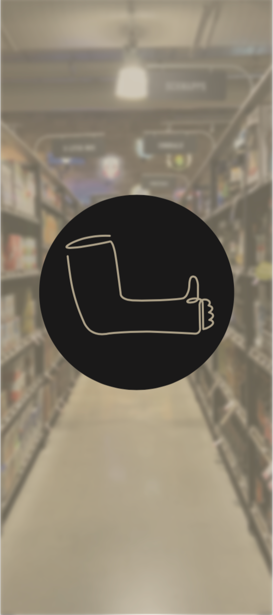


This was my final for my Advanced Digital Imaging class during the Fall semester of my senior year. It was titled the Icon Project and was based on the idea of making icons that allude to a personal experience. For each icon, we would choose a photo to base it off of. This icon did not have to specifically represent the place (i.e. a photo of a bedroom is an icon of a bed) but rather to base the icon off of a memory that we had of that place. It was meant to spark conversation about what the icon could mean and why it is connected to that place. For this project, I decided to base my icons off of photos of alleyways that I have taken. When I travel, I love taking pictures of alleyways because I like to think of them as run down, overlooked, spaces that represent the gray space between desired spaces (the buildings). For this project, my alleyways were from my home, Bloomington,MN, Readlynn, IA, and the liquor isle of the grocery store. For my home and the liquor isle, I really stretched the definition of what an alleyway is and thought of it more as a transition or a passage way to something more coveted.


These three collages are from my Advanced Digital Imaging class (Fall Semester, Senior year). This was our first assignment to get back into Photoshop and Illustrator. We were asked to use the color settings, filters, and the magic selection tool. The theme of the collages were to be political, social, and social (organized respectively). The political collage was themed on the environment and the representatives that have non-environmental mentalities. The personal collage was a self portrait that I included photos that I thought were interesting to me. The social collage was themed around the NFL and how there seems to be a seedy underbelly about the industry.


These designs were from my Advanced Digital Imaging class (Fall semester, senior year). This assignment was to redesign an album cover for a band/group of our choice as well as make a spot illustration for them. The band was Cigarettes After Sex. A lot of their album covers are very minimalist, black and white photos so I wanted to stay with their current theme. The picture is a photo I took of a monstera leaf neon light that I have in my room and when I made it black and white, it seemed to fit the aesthetic very well.


Comments